Wayfinding
Signage: when people find their way, nobody noticed a thing
Good wayfinding goes unnoticed. It prevents questions at reception – and that is its measurable benefit.
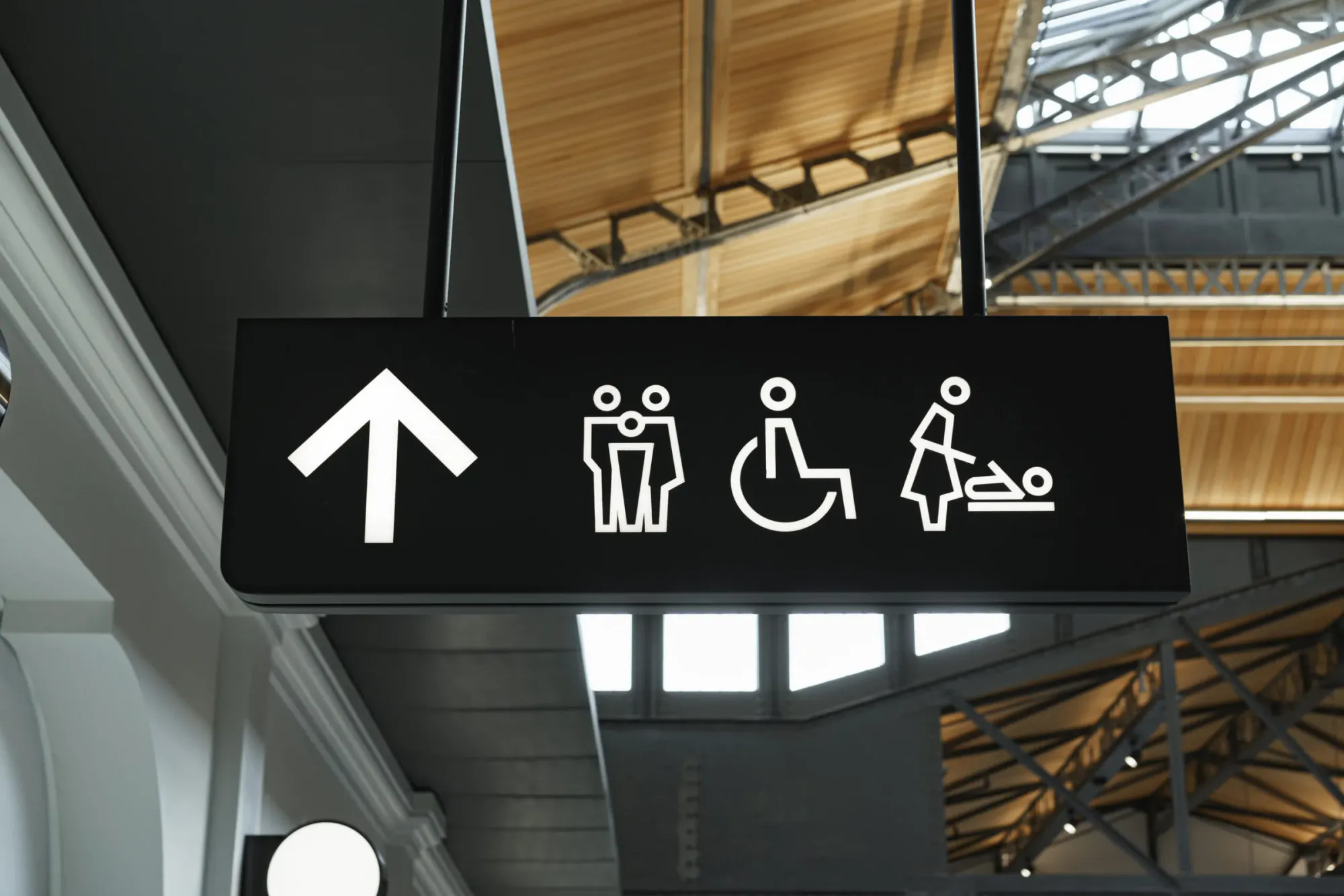
Signage is the most inconspicuous discipline in the sign trade. It is only noticed when it is missing: at reception, where the same question is asked for the twentieth time.
The route is walked first, then designed
We begin every signage project with a walk-through. Where does someone arrive? Where does the first uncertainty arise? Where does a decision have to be made? At exactly these points a sign will later stand – and nowhere else. Too many signs are as bad as none.
Three levels are enough
- Overview: where am I, what is here?
- Direction: which way do I go?
- Confirmation: I have arrived.
If the third level is missing, people turn back even though they were right. That is the most common planning mistake.
Material follows use
A door sign in a school is touched hundreds of times a year. A guidance system in a museum has to be changeable without tools. An outdoor sign carries wind and snow loads. We choose the material accordingly – anodised aluminium, acrylic glass, printed aluminium composite or film directly on glass.
Accessibility is not an add-on
High-contrast lettering, minimum sizes depending on reading distance, tactile elements at hand height and labelling that also works without colour: that costs nothing extra in planning and makes a building usable for everyone. In public buildings it is required anyway.
Type sizes by reading distance
A reliable rule of thumb: per metre of reading distance you need around three millimetres of cap height. A door sign read from two metres therefore demands at least six millimetres – in practice we use ten. A directional sign in a hall that has to work from fifteen metres needs five centimetres.
Contrast is just as important. Dark lettering on a light background reads better than the reverse, and grey on grey fails on every grey day.
Modularity saves money
A guidance system lives ten years, the names on it often only two. That is why we plan carrier and content separately: the frame stays, the insert is swapped. In office buildings with frequent tenant changes that pays off by the second change.
Digital complements but does not replace
A screen in the entrance can show the day's occupancy and events. The wayfinding itself remains printed, because it has to work in a power cut too and because people take it in as they walk past. We regularly combine both: a static guidance system plus one or two screens at the decision points.
More articles
News

Solar window film: when it pays off and when it doesn’t
Too hot in the office, faded furniture, glare on the screen: a solar window film often fixes it in a day. What it does, where its limits are and what we check before fitting.

Latex, UV or eco-solvent: which printing technology for what
Three technologies share large-format printing. The difference is not in the picture but in smell, durability and material.
Sign permits: what applies before façade lettering
In Switzerland almost every façade sign needs a permit from the municipality. Anyone who knows the procedure, documents and deadlines does not lose months over it.