Practice
Accessible website: DDA, WCAG 2.2 and 12 typical mistakes
Accessibility is regarded as an obligation of public administration. For SMEs it is above all reach: more reachable customers, better usability, more stable rankings.
In Switzerland accessibility is regarded as a public sector topic. Legally that is half true; practically not at all. Anyone who knows the most common mistakes improves reach, usability and search engine values in one go.
DDA, eCH-0059 and WCAG 2.2 – who demands what
The Disability Discrimination Act obliges the Confederation, cantons and municipalities to make their online services accessible. What that looks like is described by the Swiss standard eCH-0059, which is based on the international WCAG guidelines – currently version 2.2 from 2023. Levels A, AA and AAA grade the requirement; administrations aim for AA, and that is the sensible yardstick for companies too. Private companies are not directly obliged, but get drawn in via two routes: as suppliers to the public sector, where tenders demand conformity, and via the equality requirement for publicly accessible services.
Why it counts for SMEs too
In Switzerland around one in five people lives with an impairment, plus an ageing customer base with declining eyesight and a less steady hand. Accessibility is therefore not a niche but normal usability. Add the side effect at Google: cleanly nested headings, meaningful link texts, alternative texts and subtitled videos are exactly the signals from which search engines and AI assistants read the structure of a page. Anyone who tidies up for screen readers tidies up for the crawler at the same time.
The twelve mistakes we find most often
- Too little contrast: light grey text on white looks calm but misses the required 4.5:1 ratio for body text.
- Missing or empty alternative texts on images that carry information.
- Alternative texts such as "image" or the file name – worse than nothing.
- Headings set by appearance instead of hierarchy, i.e. H3 before H2.
- No visible focus indicator: anyone navigating by keyboard cannot see where they are.
- Controls that only work with the mouse – dropdown menus, carousels, lightboxes.
- Form fields without a linked label; the placeholder text disappears when typing.
- Error messages only in red, with no text saying what to correct.
- Link texts such as "click here" or "more" that make no sense outside the sentence.
- Videos without subtitles and without a transcript.
- Auto-starting animations with no way to stop them.
- Missing language markup, so that the reading voice pronounces English with a German accent.
Keyboard and forms are the hard cases
Contrast and alternative texts can be fixed in an afternoon. It gets more involved with controls. Our test is simple: put the mouse away and go through the most important route – home page, service, form, submit – using only Tab, arrow keys and Enter. Where you get stuck, part of your customers get stuck too. For forms we additionally check whether error messages are read out and whether an address entered once is not demanded again – WCAG 2.2 has added its own criteria for that.
Subtitles and transcripts
Subtitles are created automatically today and corrected in a few minutes. Proper names and technical terms matter, because that is where the automation errs. A transcript below the video is accessible and at the same time searchable text for search engines.
Conclusion
Accessibility is not a project with an end date but a habit in building and maintaining. A pass with keyboard, contrast meter and an automated test uncovers the largest part. We check existing sites and show which corrections take effect immediately and which belong in the next expansion step.
More articles
News
When nobody googles any more: visibility in AI answers
ChatGPT, Perplexity and Google AI answer questions instead of showing links. Anyone who wants to be mentioned has to write differently.

FADP for websites: what SMEs really have to implement
The revised Data Protection Act has applied since September 2023. What is mandatory for your website, what merely looks good – and the checklist for the next meeting.
Loading time is revenue: what Core Web Vitals really mean
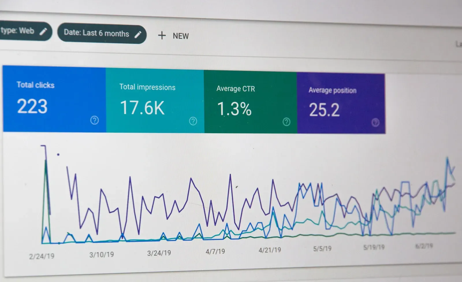
Since 2020 Google has measured how quickly and calmly a page loads. The three values are easy to explain – and usually cheap to improve.